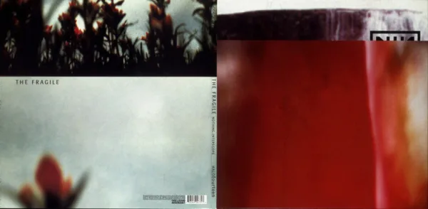
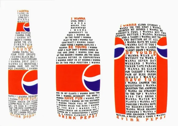
NuCollage
One of the most iconic moments: Carson published an interview entirely in Zapf Dingbats (a symbol font) because he found the article boring — making a radical statement that design could carry as much meaning as content.
David Carson made Ray Gun one of the most influential design projects of the 1990s. Unlike traditional magazines, Ray Gun’s layouts often ignored conventional rules of legibility and hierarchy. Carson experimented with distorted typefaces, chaotic compositions, overlapping images, and unconventional grid systems.
One of the most iconic moments: Carson published an interview entirely in Zapf Dingbats (a symbol font) because he found the article boring — making a radical statement that design could carry as much meaning as content.
Ray Gun's layouts often ignored conventional rules of legibility and hierarchy.
David Carson made Ray Gun one of the most influential design projects of the 1990s. Unlike traditional magazines, Ray Gun’s layouts often ignored conventional rules of legibility and hierarchy. Carson experimented with distorted typefaces, chaotic compositions, overlapping images, and unconventional grid systems.
Ray Gun's layouts often ignored conventional rules of legibility and hierarchy.
One of the most iconic moments: Carson published an interview entirely in Zapf Dingbats (a symbol font) because he found the article boring — making a radical statement that design could carry as much meaning as content.